Gigaom’s last major redesign in 2013 focused on performance and mobile-friendly responsive layout (also covered here). We’ve been iterating a lot of components since then. Great content and a delightful reading experience help build trust, but our related content recommendations help turn a search result into a second pageview and increase time on site needed to maximize ad revenue. The newsletter CTA helps us build a relationship that turns Gigaom into a regular destination. And our related research helps drive paid subscription signups (or represent the value of your subscription if you’re already a member). But improving the reading experience required a more drastic change.
The redesign introduced last week focused on:
- Creating the best, cleanest, most relaxing reading experience on the web, whether you’re on a phone, tablet, or a wide-screen desktop browser
- Increasing our ad inventory, without making it feel like there were more ads on the page (indeed, there are actually fewer ads on many pages)
- Consolidating all the improvements we’ve been making to sharing, recommended content, newsletter signups, pull quotes, and other components
- Delivering even better performance than our last redesign
All of the above are in service of increasing revenue by boosting time on site, pages per visit, newsletter signups, MAUs, paid subscriptions, and subscriber retention (KPIs listed in engagement ladder order, and sadly we can’t directly measure reader trust and happiness).
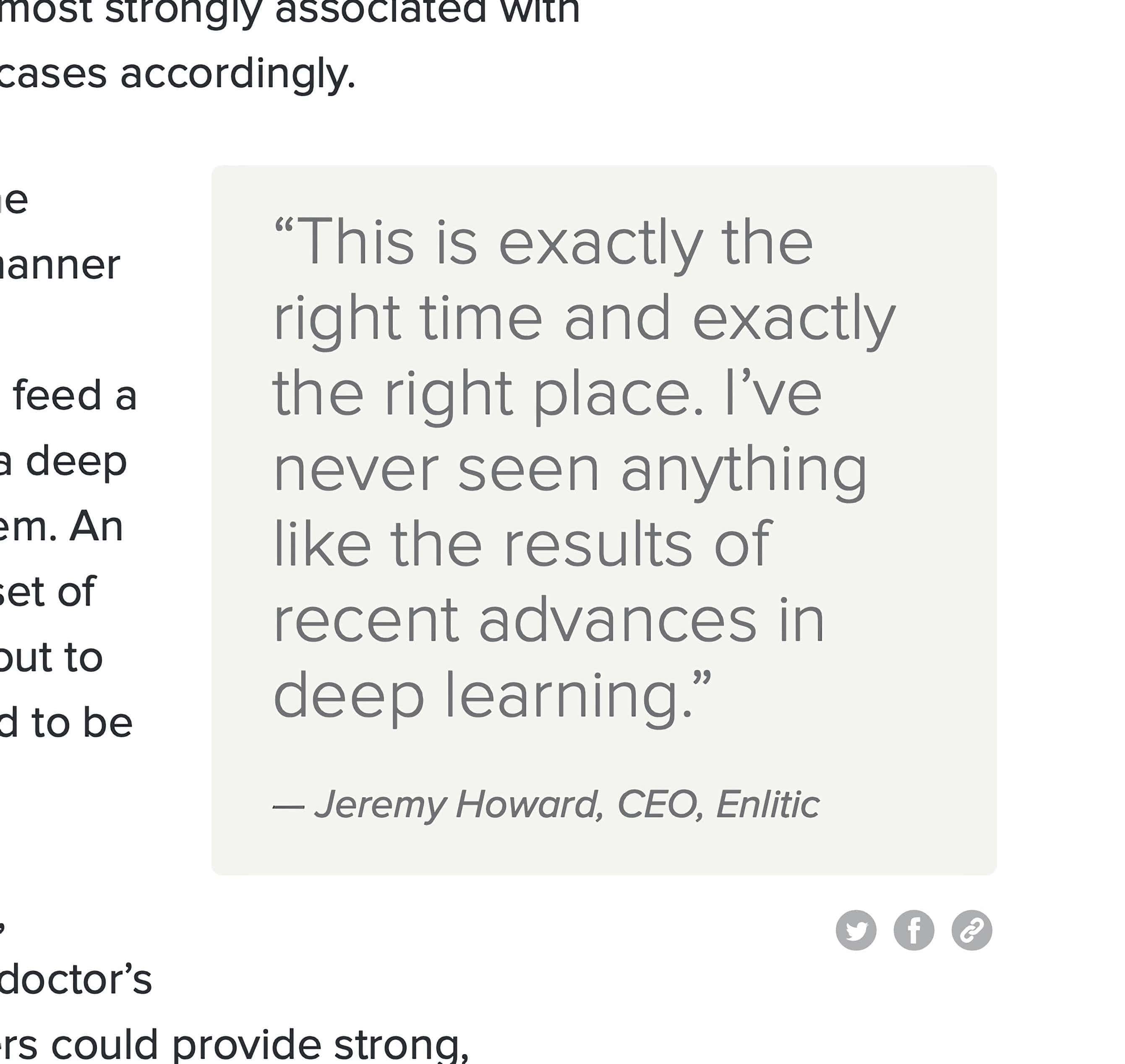
Executive Editor Tom Krazit had this to say about it:
We’ve gone from a two-column design, in which the text existed in one column and the ads existed in another column, and merged that together into a single-column design that flows much more nicely together, especially on mobile devices.
We’ve dramatically improved the size and placement of images with respect to our text, something we’ve needed to get much better at in this era of Retina displays, big monitors and excellent photographers. We’ve stripped out a few elements on the post page to make sure the focus is on the text, the images, and (of course) the ads and reminders of the other products and services that Gigaom offers.
A new row across the top of the page allows you to see what our editors believe are the top stories on Gigaom.com when you enter a post page from a social media site or a search, which the vast majority of you do. And we’ve designed a sharing widget that will follow you as you scroll down the page on the left-hand side, so when you come across that sentence that makes you go, “I have to share this,” you don’t have to hunt for that button.
This design also builds on some of the work we’ve done to improve our commenting system, which now allows you to show some love for good comments and flag bad ones. It also allows us to feature the best of your comments at the top of that section, so make sure you’re one of those really thoughtful internet commenters, as opposed to the other kind.
We focused our efforts on the post page, rather than the front page, because it’s the entry page for nearly everybody who doesn’t work here, and more than 80% of our readers’ time on the site is on post pages.
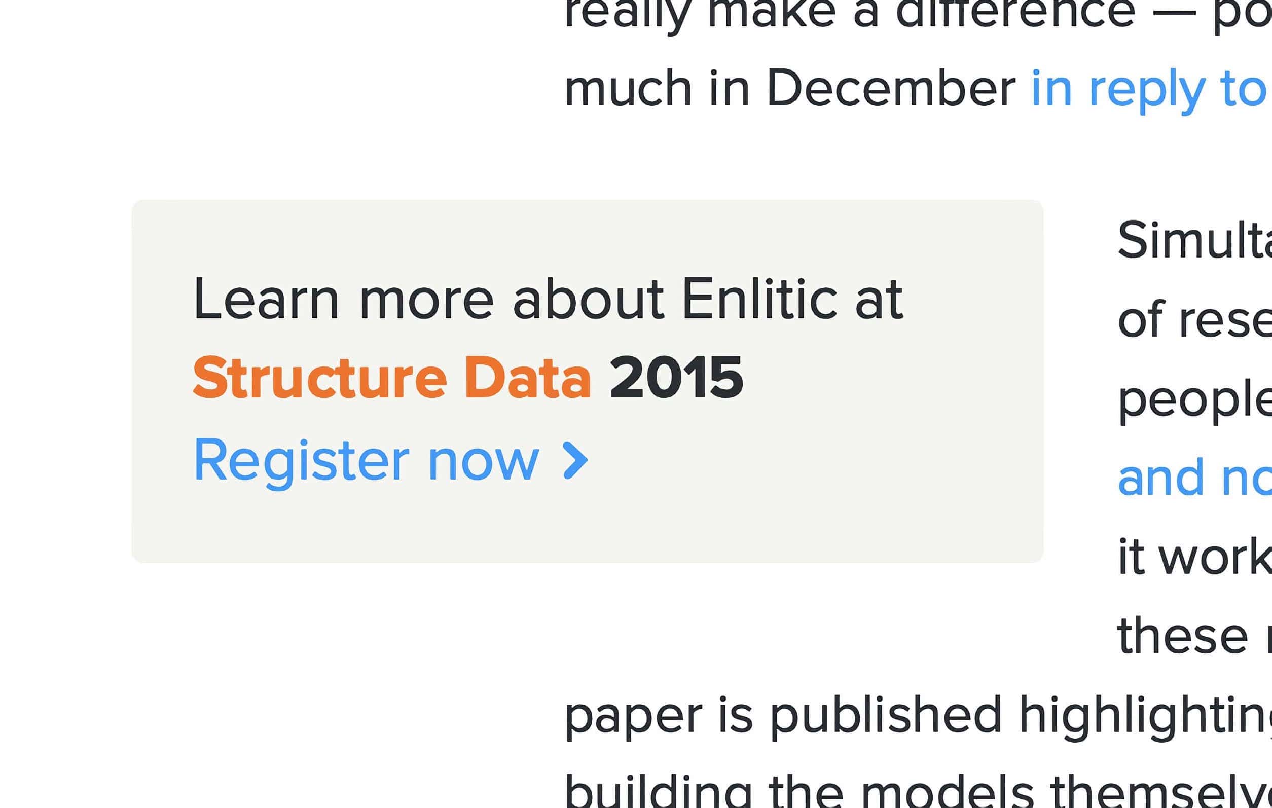
Dynamic ad placement based on post content
One of the most important changes is to ad placement and eliminating the sidebar, two details critical to improving the reading experience:
The first thing to notice is the ads appearing as bump-outs in the single text column. The number, type, and placement of ads is dynamic based on the content of the post and the size of the device. The ads avoid images, headings, pullquotes, and other block elements in the content, and the layout engine has prioritization algorithms for the ads, newsletter CTA, and other CTAs we inject. Because the number of ads on a page can vary based on the content, we tested the layout engine using actual content and page view metrics to tune it for both readability and ad inventory. The result was a 20% increase in inventory, while testers reported a better, more relaxed reading experience.
Take a look at how the ads avoid the images in this post, and the newsletter CTA nestled into the text below.
Smart newsletter signup/email capture CTA
The newsletter CTA nestled into the text, between images:
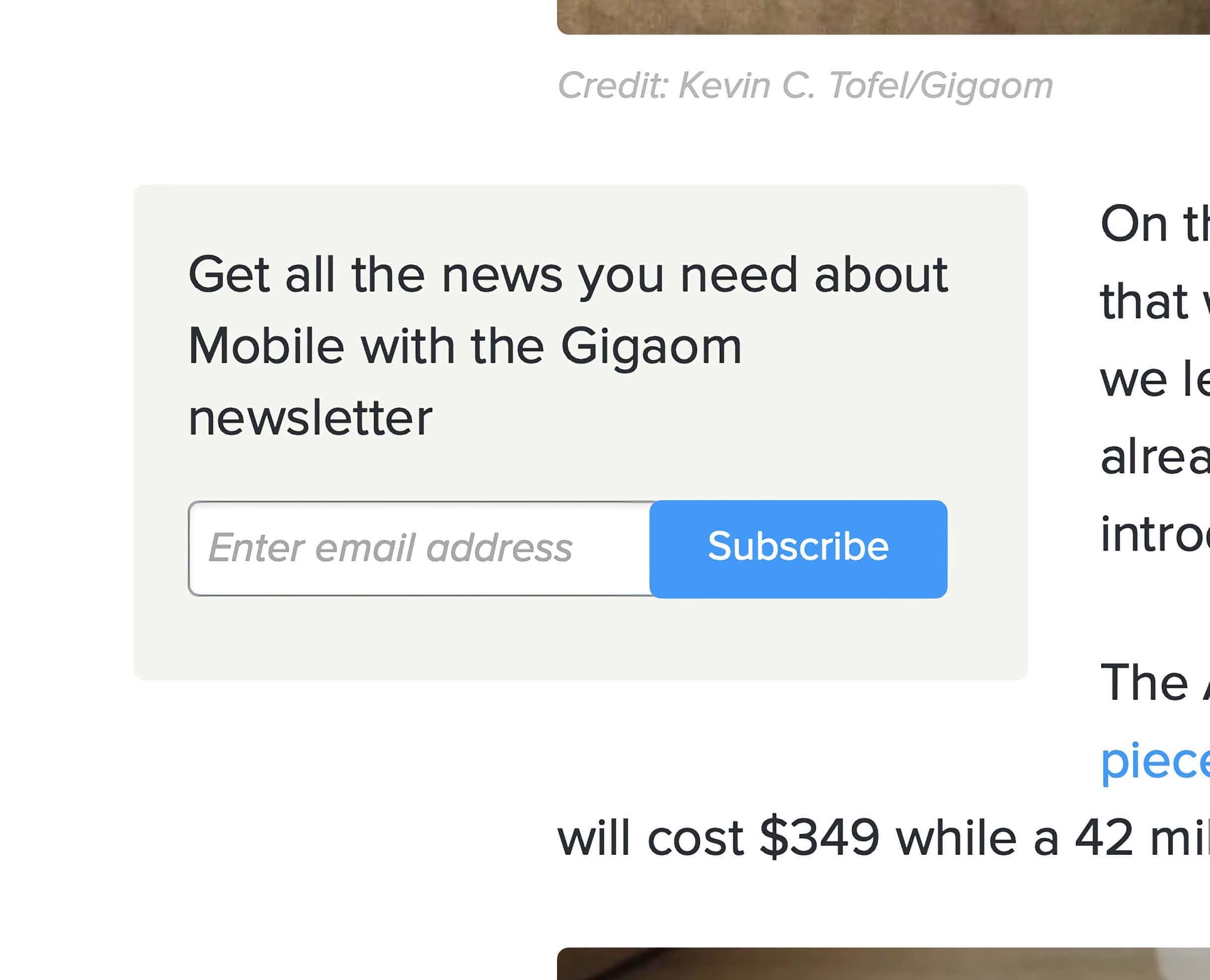
The newsletter CTA is critical to increasing MAUs and other KPIs that are relevant to both advertising and subscription monetization. The CTA is specific to the primary channel the post is in, and we have some smarts about how when this unit is displayed. Sometimes it appears as a bump-out from the column on large screens, sometimes below the content. When it appears on mobile devices, it’s shown below the content.
Related content recommendations
The related content in a post about Snapchat’s latest funding efforts:
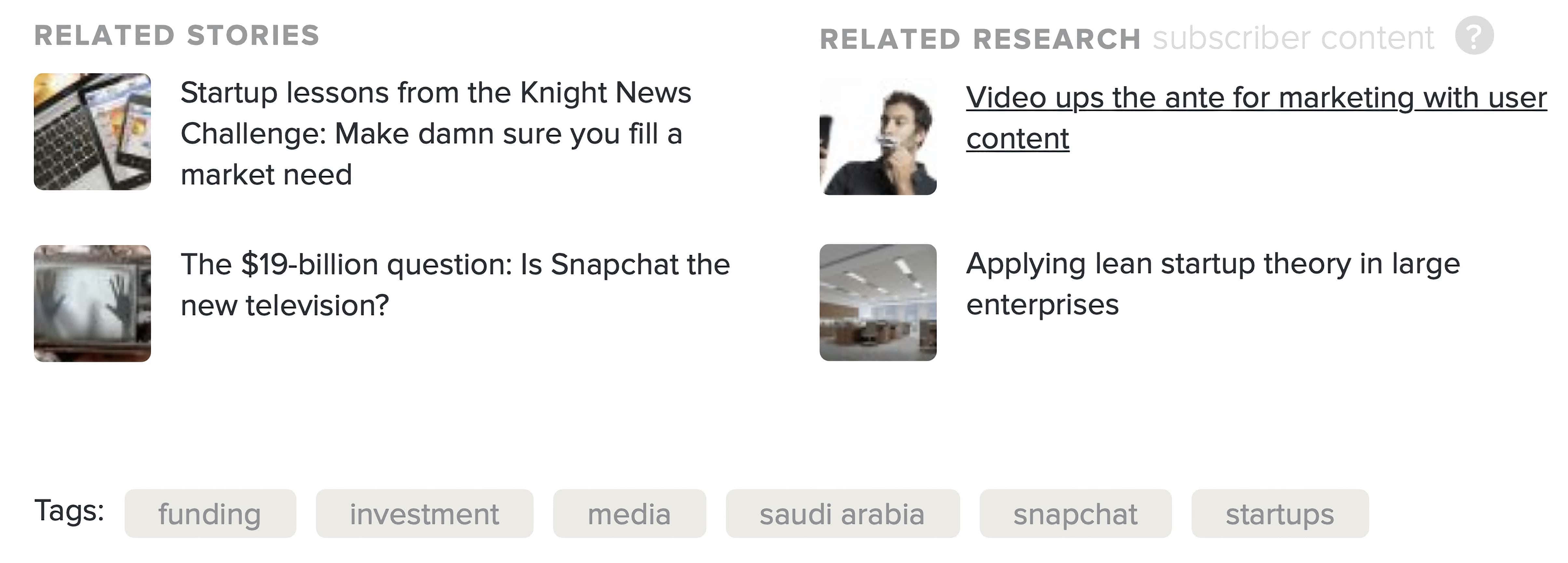
The algorithmically generated related posts drive pages per visit (increasing ad revenue), while related research content directly drives subscription revenue. We’ve done a lot of iterating across a number of dimensions to improve how well this unit drives additional page views and subscription sales. Algorithmic quality is half the challenge, placement and other details are the other half.
Related events CTA
Here are some features as they appear in an old post:
This is basically an ad unit for our live events. Events are algorithmically relevant to the content. The unit is displayed as a bump-out from the column on large screens but runs through the text column on mobile devices.
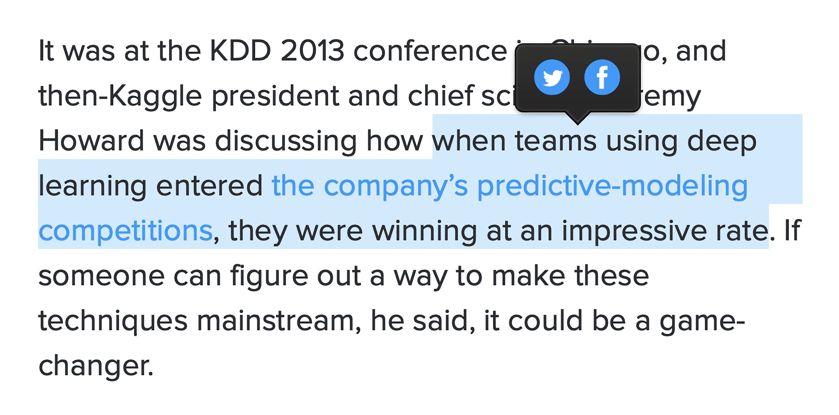
Pullquotes
This single-column layout is perfect for big pullquotes that bump-out of the text. Of course, they’re sharable.
Sharable selections
See something interesting? Just select it to get easy tools to share it. Or copy and paste the text as you normally do, we won’t insert any annoying extra attribution or copyright language.
Comment reactions
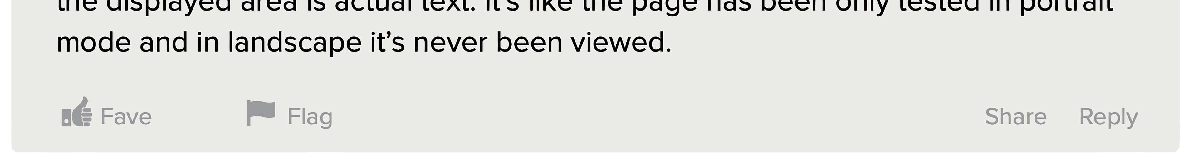
We invite readers to tell us about great comments and those that might need our attention. Our team is taking action on comments that violate our community standards and featuring the best comments for all to see.
This was a team effort
It’s one thing to achieve results like this in a static site, but it’s another matter to build flexible systems that work for hundreds of thousands of posts published over nearly a decade, and for a team of contributors, writers, and editors going forward with the daily effort of making sense of the news. As an engineering team, we were also building something we’ll need to maintain over time, knowing that we’ll need to respond with agility to the next priority of the moment without ruining or being blocked by the progress made here.
While the layout is deterministic given a fixed set of variables, those variables are…quite variable. The testing and modeling behind the layout gymnastics were truly exceptional, and the design, QA, and user-testing equally so. Credit goes to the entire team and their willingness to repeatedly do one more iteration, one more round of tests to get everything right…and then make it work in every browser.
This is a huge step in bigger picture systems thinking we’ve been doing as a team, but the foundations for this started iteratively and we’ve been building toward it over time. A number of components are open source in Github (a few pieces are in my Github), though the theme itself and the layout engine are not open source.
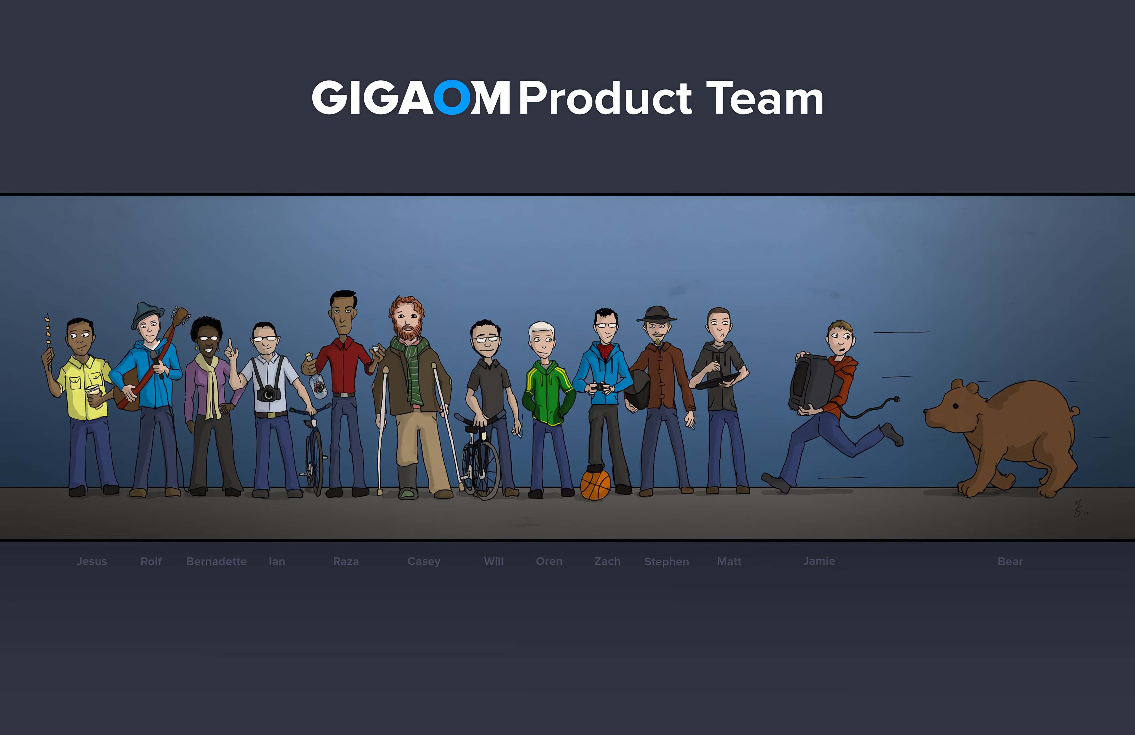
The product team by Matt @borkweb. Clearly, I will never live down my broken ankle with this group.