tl;dr: A great cloud and devops user experience starts tools and APIs optimized for gitops-first workflows. A good web console and visual user experience adds value for all users, enables visual discovery and experimentation, and opens the platform to use by those who haven’t fully adopted gitops workflows. Below is the story of how we designed that experience, and designed for scaling across multiple product and service teams.
By the end of 2016, ContainerPilot was getting great reception, and there was great demand for a dashboard from which people could see the state of their applications. Similarly, Joyent customers were demanding more sophisticated tools to schedule their Docker containers on Triton.
Unlike other clouds, Docker containers on Triton run on bare metal, not in VMs. Triton emulates the Docker API, so customers can simply do docker run myapp via docker or docker-compose, and never have to start or manage VMs.
Everything in Triton was designed API/gitops first, but visualizing the application and its metrics was still a critical need for a large segment of our target market. In broad strokes, enterprise users want a “single pane of glass” management view of the application, and even the most sophisticated devops teams often appreciate visual interfaces as a way to explore the capabilities of a platform and the apps running on it. Customer development interviews and feedback from sales conversations validated a market opportunity, but the next step was to do some mocking and prototyping to further explore it.
Customers loved the features and functionality they imagined from this clickable mockup.“Build, measure, learn” was great advice, “align, learn, measure, build” is better
I’ve long believed that anybody can learn the technical details for a project. The skill is being able to see opportunities to add value or reduce complexity leading to a great user experience. That priority led me to the Make Us Proud team.
Bringing in a team with a portfolio of great consumer experiences required additional effort on the technical details, but it made it easy for us to question every assumption, and pushed us to better understand and validate goals we needed to align on. This is when I truly understood that build—measure—learn is backward, a point team founder Anthony makes in his post “products should start with what you want to learn, not what you want to build.”
These slides summarize a few user testing surprises we worked through:
Another great piece of advice from Anthony: “stop falling in love with your ideas. Fall in love with the outcome.”
Testing internationally
Tools used by globally distributed teams need to be intuitively understood globally. All design leverages user expectations or instinct—consider the order of buttons in a dialog box, for example—but how do those expectations and instincts vary internationally?
One example: an innovative natural language interface for firewall rule definitions tested well with native English speakers, but performed poorly compared to a more structured table view with non-Native speakers. Learning that early—before we built the wrong solution—saved us time.
Think systematically to reduce complexity, increase velocity, and improve user outcomes
When looking at competing clouds it’s easy to see how the UI/UX changed as the scope of the services evolved. In some cases, the UIs look like separate teams took very different approaches to similar problems, leaving customers to make sense of inconsistent interfaces.
With this in mind, we designed for a bigger problem than we were ready to build for, and we planned for a team structure that allowed every service team to work independently while leveraging a design system and consulting with a central team to ensure consistency.
Yaili, the lead designer asks “do I need a design system?” The answer, of course, is “yes,” but here’s a visual telling, and how we structured UI/UX work at Joyent:
And here’s a shorter overview of just the UI toolkit:
The Joyent design system is open-source. See the UI toolkit, Figma, and source.
Scope management
Though we started design with a huge scope—exploring the details of application management and even building a working prototype that could deploy docker containers live—the first production component was instance management. This approach allowed us to build a lovable product with a smaller scope first, accelerating our time to value.
Demoing the working instance management console.The design team
I was excited to be able to bring in the great folks at Make Us Proud and YLD to kickstart this visual UI/UX effort. They were truly a wonderful team to work with, and Antonas Deduchovas documented his experience in a series of five articles detailing his process of discovery:
- Joyent CoPilot: Bringing Application Awareness to Cloud Infrastructure, Part I
- Part II
- Part III
- Part IV
- Part V
Similarly, Alex Jupiter did a series of posts with his lessons learned:
- A CoPilot Story (Pt 1): Welcome to CoPilot
- (Pt 2): Our Product Creation Process…
- (Pt 3): Designing Metrics
- (Pt 4): Designing Notifications
- (Pt 5): Designing The Service & Application Catalogue
- (Pt 6): Designing Versioning
Everything is open-source, including the UI toolkit (see this path In the larger repo).
Finally, two more posts worth linking here:
- Do I need a Design System?, by Yaili, who was instrumental in shaping the design system to meet our needs
- Products should start with what you want to learn, not what you want to build, by Anthony, the founder of Make Us Proud

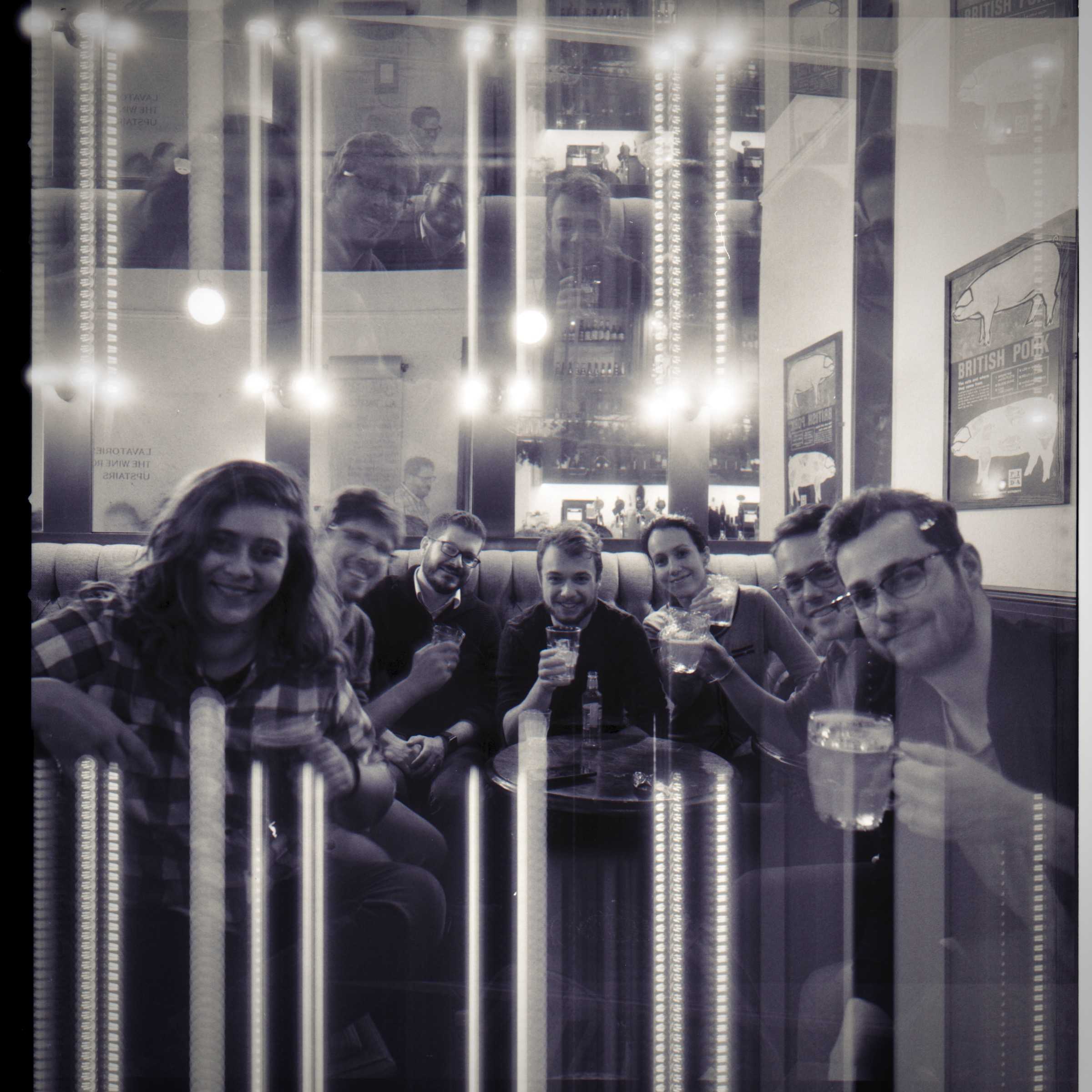
A portion of the team in December 2017. No filter, shot on film.
The share image for this post comes from Antonas’ posts.